
[HOME]
[WEB ALBUMS]
[PROJECTS]
[ARCHIVE]
[DOWNLOADS]
[LINKS]
PROJECTS
Project MK7: Capure Fast Multi Cannel Solar Data Alfven waves with a RTL dongle
With an offsetdish of 1m and a MEADE tracking mount and a fast sampling program some interesting data from the sun was captured.
On may 08 2014 I captured on 21cm a nice burst at 10.02 UT. Other details can be found on http://www.swpc.noaa.gov/alerts/warnings_timeline.html
The SOLRAD software captures 40 spectra in 0.1 second and takes the mean spectrum value of it.
Next the the resulting spectrum is split up into 10 frequency segments over the entire band.
So when you had selected on your SHARP# screen a sample rate of 2.4MS/s, then you get 10 channels with a bandwidth of 240kHz each with a time resolution of 0.1s.
After 1 hour the 36000 values of each of the 10 channels are written as a txt file to HD; 915kB per channel.
Later the files can be shown as graphs in excel or other program; I use python.
The added graphs are interesting, because I think that you can see the Alfven waves in it. The modulating frequency is from about 0.15 to 5 Hz.
Also you can see, the oscillation starts in the higher frequency channel and is followed by the lower channel.
If I look at the trailing section, then I see the reverse.
So it can be concluded that the disturbance of the magnetic field lines starts in the lower sun's region.
From the raw 10 files next the base line is subtracted; see the overview png.
Next all the graphs are plotted on top of each other; so now you can see the phase alignment more clearly.
The bottom graph is the mean of the 10 bands; so you can see now that the preburst phase amplitudes are random, and the mean value is approaching zero.
Coming up to the burst and the burst itself shows that the graphs are synchronising there amplitudes.
This means that the magnetic "rubber band" string/colomn starts to "shiver" because of a "sidekick" at the base of this magnetic loop.
Also attached is a scientific paper describing an equal observation; see fig 3a and fig 6.
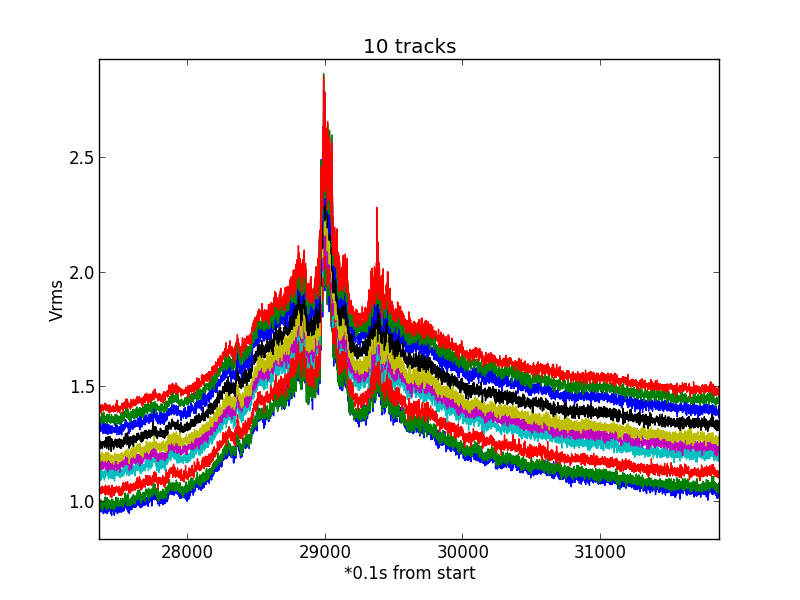
Fig.1 - Alfven wave 0a2.
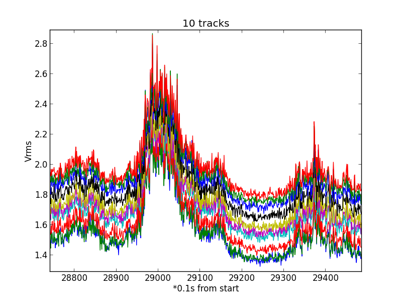
Fig.2 - Alfven wave 0a3.
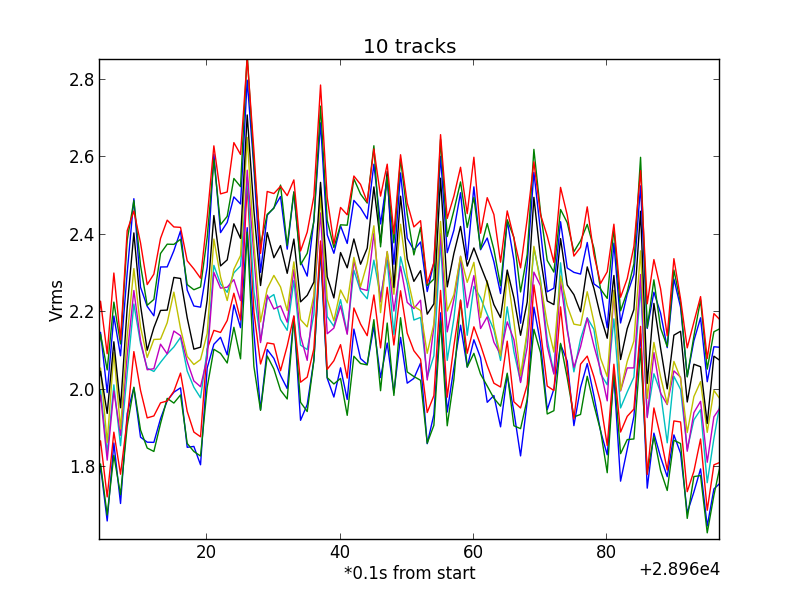
Fig.3 - Alfven wave 0a4.
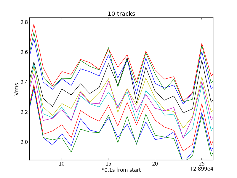
Fig.4 - Alfven wave 0a5.
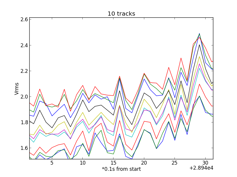
Fig.5 - Alfven wave 001c.
Here are some more details. Now the running avarage value is subtracted and the "ac" component remains. Again when zoomed in, you see coherent signals in all the channels.
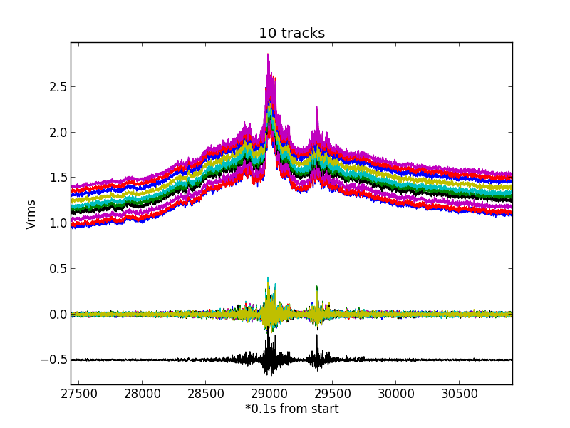
Fig.6 - Alfven wave b002.
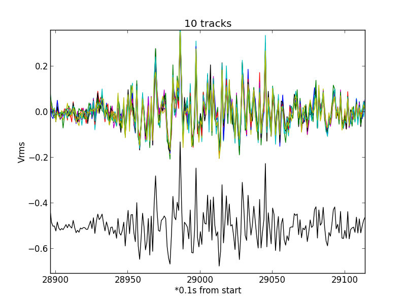
Fig.7 - Alfven wave c002.
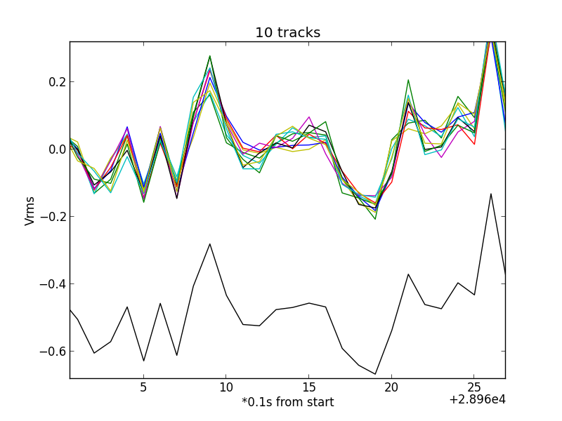
Fig.8 - Alfven wave c003.
If you want to plot and examen the curves yourself, then download the plot file with all the data here: Alfven plot + data
On http://www.phy.uct.ac.za/courses/python/examples/moreexamples.html#wavelet-analysis-continuous-wavelet-transform I found a script to plot the changing frequency of a captured measument.
It is called a Morlet wavelet analyses. A gaussian window is shifted over the data string, and the frequency and intensity is recorded. So, you can analyse frequency change in time.
Here is the result when the file is scanned by that window.
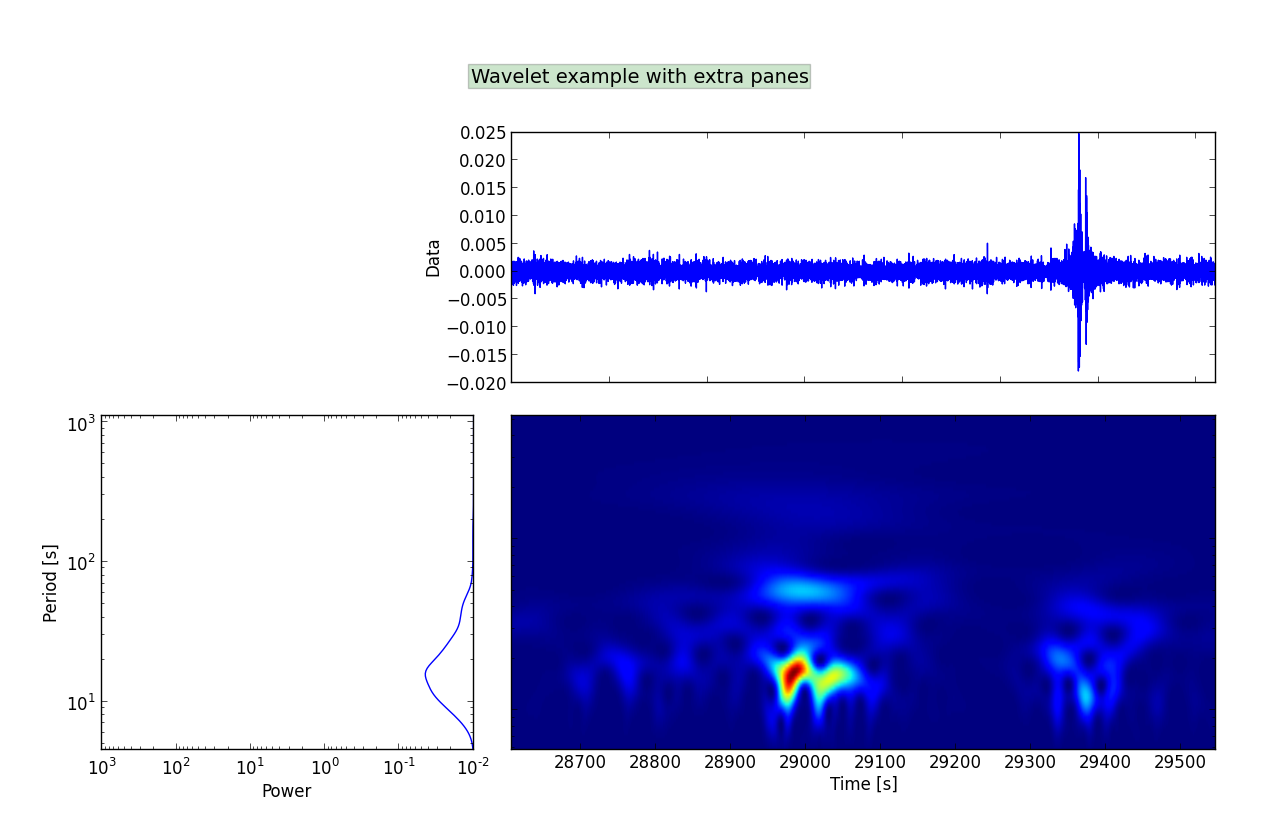
Fig.9 - Morlet Ghost.
referenced paper here
Michiel Klaassen november 2014